Overwatch League just announced they are partnering with Twitter to have official hashtags/emotes for the 2019 season. For those who have no idea what I’m talking about, go on Twitter and put in any hashtag you can think of. A hashtag is a nice way to get your message circulated, but these Overwatch League ones are special. Put in one of the team/league specific ones and an emote is generated, like this:
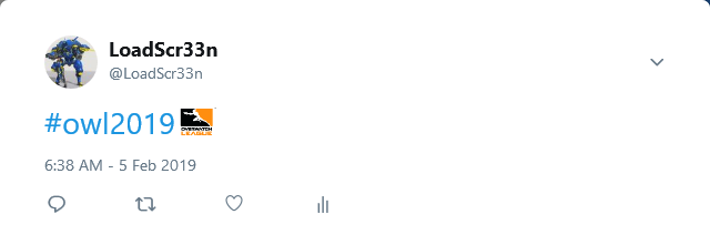
Pretty sweet right? Well, for no other reason other than it’s what we do, let’s rank these bad boys. I’m judging these both by the hashtag phrase they use and the team’s logo. The ones I put at the top were the ones that sounded the most badass, while the ones at the bottom make me roll my eyes. That’s the barometer. Without further ado:
#20 – New York Excelsior

Ever upward? To what? Where? How? Why? What does this mean exactly? Also I am not a fan of that logo. Too on the nose for me.
#19 – Houston Outlaws

Such wasted opportunity. Loved that they used Texas, but hard? What is that about? “Texas Forever” is an all time TV line, but Texas Hard? Just an absolute swing and miss.
#18 – Vancouver Titans

That new logo is lit, but force of nature is too pretentious to make it move for me. There had to of been something better out there to pair with that awesome logo.
#17 – Los Angeles Valiant

Now we’re getting to the place where I don’t hate the hashtag but it’s just not getting me revved up. Something about wings coming out doesn’t exactly light the furnace. A valiant effort, I’ll say.
#16 – San Francisco Shock

No one will ever be shocked by the Shock. Just not going to happen. That logo has also always been a bottom feeder logo in this league, so I gave them points more for the hashtag than logo.
#15 – Guangzhou Charge

Seems like someone let the intern run the social media accounts. Feel the charge? That’s the best you could come up with? Doesn’t exactly inspire confidence. Feel like this was another missed opportunity.
#14 – Seoul Dynasty

I actually really like this one. I just like the others better. Good effort Seoul – here’s hoping your effort in the game matches this.
#13 – Toronto Defiant

Really like this one too – very straightforward, clever, and clean. Could see this on a billboard or poster or shirt. Well done.
#12 – Florida Mayhem

Another clever hashtag that matches up well with the logo. I like the branding and I’m sure their fans will too.
#11 – Atlanta Reign

This one is pretty well done too. Problem is I can’t really see the logo very well in this format. Weather it’s Twitters fault or not, that logo doesn’t shine as well as it usually does.
#10 – Los Angeles Gladiators

Only one team gets to use the word “Up” – and it aint you guys. I get it but sorry, no.
#9 – Chengdu Hunters

Everyone knows the Chinese expansion teams brought the heat with branding during the offseason. The Hunters have an all-time mascot. Pairing it with a fun, playful hashtag like that is a no brainer. Excellent job.
#8 – Washington Justice

Not sure why but after seeing this I feel like running through a wall and waiving an American flag. Just seems so well thought out. I want to see this blasted after every one of their wins.
#7 – Paris Eternal

I have no idea what any of this means but I had to give points for leaning in on the foreign language. No one else is doing that – very bold.
#6 – London Spitfire

Between these guys winning the championship last year and that awesome spitfire branding, how can you not respect this? Aces high just screams intimidation. This was well thought out and will likely be heard throughout the league all season.
#5 – Dallas Fuel

Dallas’ logo has always been top tier for me, and this hashtag has ups the ante. Really like how it connects to their logo. It’s straightforward and badass.
#4 – Philadelphia Fusion

This could have gone either way. If you cringed at seeing this I don’t necessarily blame you. However, I’m a sucker for a good pun. This one was too clever not to boost to the top.
#3 – Boston Uprising

Other than the Outlaws, no other team mention their home town. Whereas they got weird by saying “Hard” – this one makes much more sense. Pairing the city name with a connection to your logo is so straightforwardly brilliant. Why didn’t anyone else do this? Also, because it’s Boston, the greatest city in the world, it gets massive bonus points.
#2 – Hangzou Spark

I think the general consensus is that the Hangzou won the offseason expansion branding war. Both the baby blue/pink colors and the snapping finger logo are absolutely electric. Paired with the only one word hashtag, and that being the word “Bang”, almost wins singlehandedly. I can see fans shooting these suckers out everytime a Widow takes someone down. Whoever is running the branding ship over there is doing it right.
#1 – Shanghai Dragons

Everyone at the end of last season was rooting for Shanghai to win. That last game had everyone standing in anticipation of them getting their first win. We all are hoping for Shanghai to break through – so here’s me doing my part to get them there. I’m a believer.
